
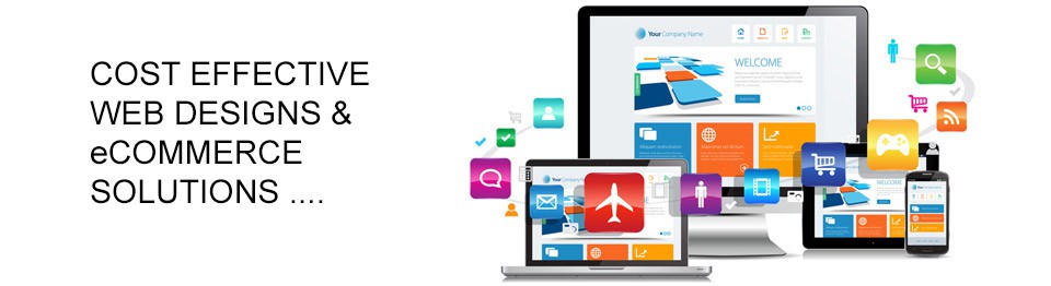
This decade we have witnessed a virtual EXPLOSION of Smart Phone and Tablet computers being used for web browsing. To leverage this growing market segment your web site needs to work reliably with small screen devices.
We can create for you a website that not only looks and works well on older desktop computers, but also on the latest smart phones and tablet computers. Images will fit the available screen space and text will remain crisp and legible without the need to "zoom" or scroll from side to side.
In fact our design aproach is to not only cater for today's devices but to most likely automatically adapt to the new devices that are not even yet for sale.
This website is an example. Try viewing it on a smart phone, notebook computer, tablet and desktop machine. Each will display a slightly differently proportioned web site but all will be fully functionable and text readable. We are able to design "bootstrap" style websites and convetional websites which are strongly focused on the mobile world.
NONE. This is just the way we now build web sites.